
When it comes to creating an effective storefront or outdoor display, choosing the right business sign fonts can make or break your visibility. Especially in a competitive and visually dynamic city like Sugar Land, where shoppers and professionals are constantly on the move, your sign needs to catch attention fast—and hold it. Whether you’re undergoing a rebrand or managing signage updates for a large commercial property, understanding what makes a font readable and impactful is key to delivering value.
Why Font Choice Matters More Than You Think

For marketing managers, property managers, and anyone overseeing brand identity, it’s easy to focus on colors and logos. But fonts play a silent yet powerful role in brand perception. The best business sign fonts strike a balance between style and readability—ensuring your signage looks professional while being easy to read from a distance.
A clear, well-chosen font helps customers identify your business quickly, even in challenging conditions like Sugar Land’s humid summers or during dusk hours when lighting can be low. A poor font choice, on the other hand, could cause potential clients to miss your business entirely—especially in high-traffic areas like Highway 6, Sugar Land Town Square, or First Colony Mall.
Characteristics of Readable Business Sign Fonts
Simplicity Is Crucial
Fonts with clean lines, uniform spacing, and clear lettering work best for signage. Sans-serif fonts like Helvetica, Futura, and Arial remain some of the most popular fonts for business signs because they’re easy to read at a glance. These fonts are especially effective for outdoor signage where visibility is a top priority.
Size and Scale Matter

No matter how stylish a font is, it won’t help your business if it’s not scaled properly. A good rule of thumb is that every inch of letter height provides about 10 feet of readability distance. For example, signage near University Boulevard or the Smart Financial Centre should use large, bold fonts to accommodate fast-moving traffic.
Contrast and Color Pairings
Your font won’t stand out if it blends into the background. High contrast between your font color and the background color is essential—think white fonts on dark backgrounds or black fonts on light backgrounds. In Sugar Land’s sunny climate, UV exposure can fade colors over time, so be sure to choose high-quality materials and coatings that resist wear.
Best Font Styles for Different Business Types
Retail and Storefronts
Retail signs benefit from bold, attention-grabbing fonts. Consider modern sans-serif options like Montserrat or Gotham, which pair well with contemporary branding and are easy to read from the street.
Professional Services and Offices
For legal firms, medical practices, or financial services in areas like the Lake Pointe or Telfair neighborhoods, a more refined and conservative font such as Garamond or Baskerville may be appropriate. These serif fonts project credibility while maintaining clarity.
Hospitality and Entertainment
Restaurants, bars, and entertainment venues often get creative with their signage—but readability should still be a priority. Script fonts can be used sparingly, especially for secondary text or logos, but the main message should always be in a clean, legible font.
Common Mistakes to Avoid with Business Sign Fonts
Over-Styling
Decorative fonts can quickly go from eye-catching to hard-to-read. This is a common pitfall for businesses trying to stand out in busy areas like Sugar Land’s Imperial Market. Avoid overly curly, condensed, or all-uppercase fonts unless they’re highly legible.
Ignoring Local Conditions
Fonts may look great on paper but fail in real-world conditions. Consider Sugar Land’s weather—hot summers, strong sun, and occasional heavy rains. Choose fonts and materials that remain legible and sharp despite wear and tear.
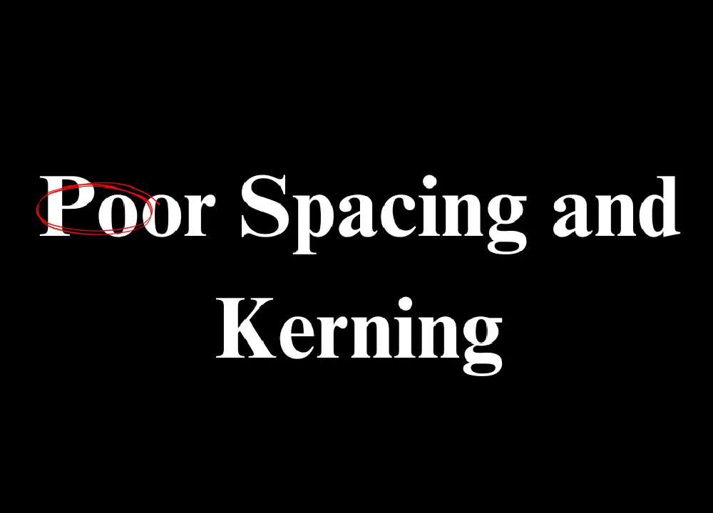
Poor Spacing and Kerning
Letter spacing, or kerning, affects how readable your signage is. Too much or too little space between letters can make words hard to decipher. This is especially important for long-distance viewing where legibility needs to be instant.
Ready to Make Your Signage Stand Out?
Designing business signage isn’t just about making something that looks good—it’s about creating a visual message that works in your environment. Professional sign designers and installers understand how fonts interact with lighting, distance, and viewer perception.
If your business is located in Sugar Land or the surrounding areas, investing in expert advice can elevate your entire brand presentation. A font that works well for your logo might not translate well to a 20-foot sign viewed from across the parking lot.
Need help choosing the best business sign fonts for your location, audience, and brand message? UNI Signs can help you create signs that not only look great but also perform well in the real world. Whether you’re managing a property in Sugar Land’s corporate district or planning a rebrand in a retail center, our team ensures your signage is readable, impactful, and built to last. Contact us today!