
In the bustling world of business signage, where visual communication reigns supreme, the importance of legibility cannot be overstated. A sign’s primary purpose is to convey a message, and if that message isn’t easily readable, its effectiveness is compromised. Whether it’s a storefront sign, a directional sign, or an advertisement banner, ensuring legibility is key to making a lasting impression on your audience. In this blog, we’ll delve into the critical role that letter sizing plays in sign making and why it’s essential for clear communication at various distances.
Why Legibility Matters
Imagine driving down a busy street, trying to locate a particular store, only to be met with a sign that’s so small or poorly designed that you can barely decipher its message. Frustrating, isn’t it? This scenario highlights the significance of legibility in signage. Whether your target audience is pedestrians passing by or motorists cruising down the highway, your signs need to be easily readable to capture their attention and convey your message effectively.
The Science of Letter Sizing
One of the key factors influencing legibility in sign making is the size of the letters used. The distance from which your sign will be viewed determines the appropriate letter size to ensure readability. The farther away your audience is, the larger the letters need to be for optimal legibility.
According to industry standards and guidelines, there are recommended minimum letter heights based on viewing distances. For instance:
- For pedestrian traffic (viewing distance of 2-10 feet), letters should typically be at least 3 inches tall for optimal legibility.
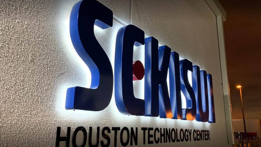
- For vehicular traffic on local streets (viewing distance of 10-40 feet), letters should be at least 8 inches tall.
- For highway traffic (viewing distance of 50-400 feet), letters should be a minimum of 16 inches tall or more, depending on the speed limit and other factors.
These are general guidelines and may vary depending on factors such as font style, color contrast, and environmental conditions. However, adhering to these recommendations can significantly enhance the readability of your signs across different viewing distances.
Ensuring Compliance and Accessibility
In addition to optimizing legibility for the general population, it’s essential to consider compliance with accessibility standards, such as the Americans with Disabilities Act (ADA). ADA signage requirements mandate specific guidelines for letter sizing, spacing, contrast, and tactile features to ensure that signs are accessible to individuals with visual impairments or other disabilities.
By incorporating ADA-compliant elements into your signage designs, you not only enhance accessibility but also demonstrate your commitment to inclusivity and compliance with regulatory standards.
Font Selection and Readability
In addition to letter sizing, font selection plays a crucial role in the legibility of vehicle wrap lettering. Choose fonts that are easily readable from a distance and avoid overly decorative or intricate styles that may be difficult to decipher, especially at high speeds or in motion.
Bold, sans-serif fonts tend to work well for vehicle wraps, as they offer high contrast and clarity even from a distance. Test different font styles and sizes to find the optimal combination that ensures readability while complementing your brand’s visual identity.
Mockup and Testing
Before finalizing your vehicle wrap design, it’s essential to create mockups and conduct testing to evaluate legibility under real-world conditions. Consider factors such as lighting, background contrast, and motion to assess how well the lettering stands out and communicates your message effectively.
By meticulously planning and fine-tuning letter sizing for vehicle wraps, you can create impactful mobile advertising that captures attention, communicates your brand message, and leaves a lasting impression on viewers wherever the road takes you.
In the world of sign making, legibility is paramount. By understanding the importance of proper letter sizing and adhering to industry standards for various viewing distances, you can create signs that effectively communicate your message to your target audience. Whether it’s guiding pedestrians to your storefront or capturing the attention of motorists on the highway, clear and legible signage is the key to making a lasting impression and driving engagement with your brand.
Uni-Signs, based in Katy, TX, specializes in crafting high-quality indoor and outdoor business signage solutions tailored to meet the unique needs of their clients. With expertise in custom signs, logo signs, backlit signs, pylon signs, and monument signs, Uni-Signs is dedicated to helping businesses stand out and make a lasting impression. From concept to installation, they prioritize innovation, quality craftsmanship, and customer satisfaction, ensuring that each signage project reflects the brand’s identity and effectively communicates its message. Trust Uni-Signs to elevate your business presence and leave a lasting impression in the competitive marketplace.